
The client is a ecommerce jewelry store specializing in engagement and wedding rings. They were hampered by a few performance issues, so the initial scope of work was limited to the development team repairing a handful of bugs. My role as a designer was to review the site and make recommendations for user experience and user interface improvements in an effort to continue the relationship beyond the initial bugs project.
Heuristic/Expert Review
I compiled a prioritized list of 85 issues including wildly inconsistent button styling, unexpected mouseover behavior, and poor information architecture. My review even uncovered additional bugs, including problems scrolling on mobile (which was a particularly troubling bug given the increase in mobile traffic discussed in more detail below).
This type of analysis is important to do on new projects with existing websites or applications because it’s likely the owners of the product have habituated many of the problems.
While it may seem obvious that a shopping cart page shouldn’t have six equally-weighted calls-to-action, it’s entirely possible that those close to the site had grown accustomed to it. Surfacing this and similar issues and alerting the owners to the risk is the result of this type of analysis.
To help the client visualize some of these major issues, I created mockups that could be compared with the current pages. These screens show the existing cart page with several visually heavy buttons and a proposed redesign with the checkout button being the singular call-to-action at that weight.
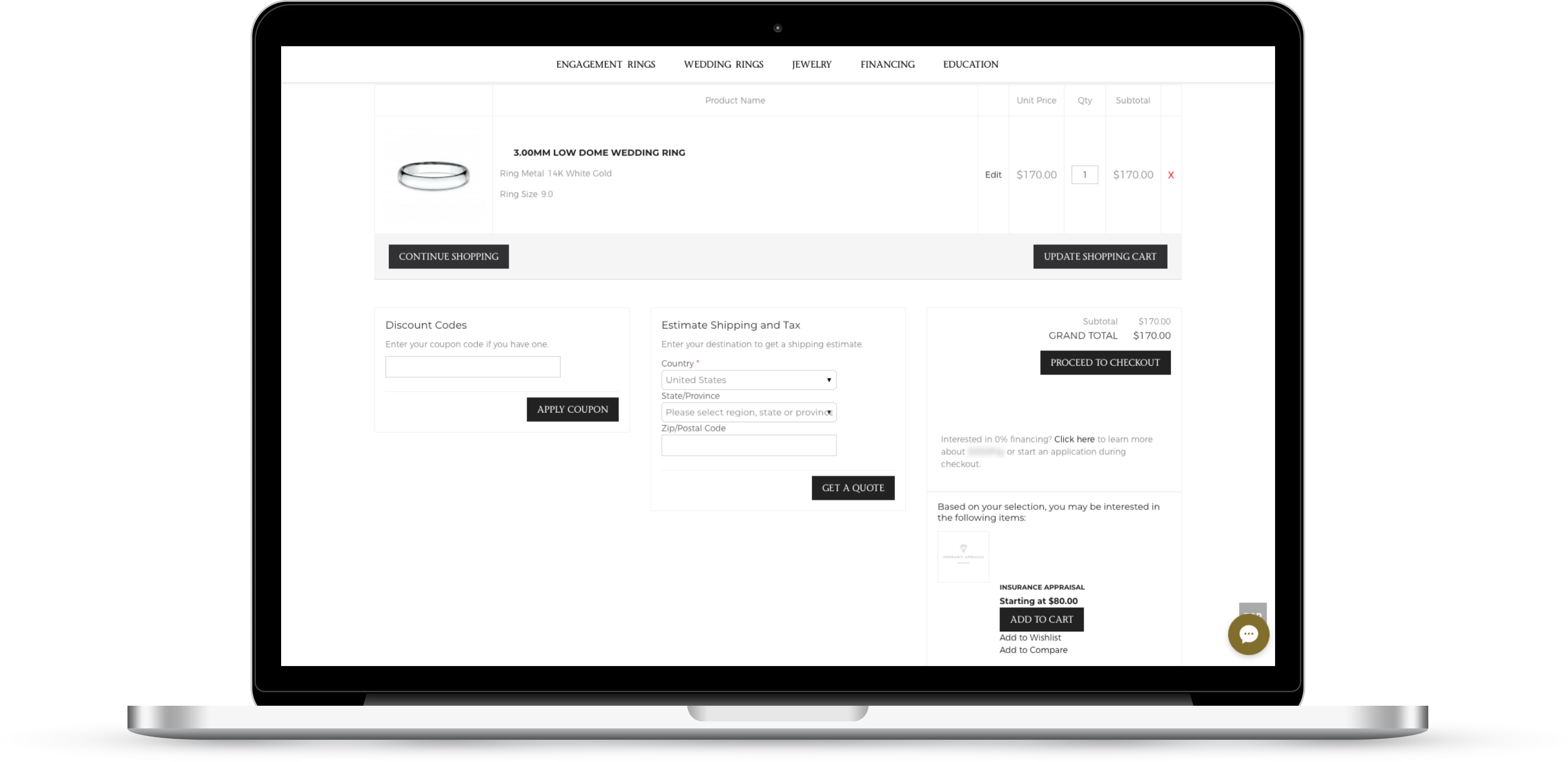
Shopping Cart Page – Before
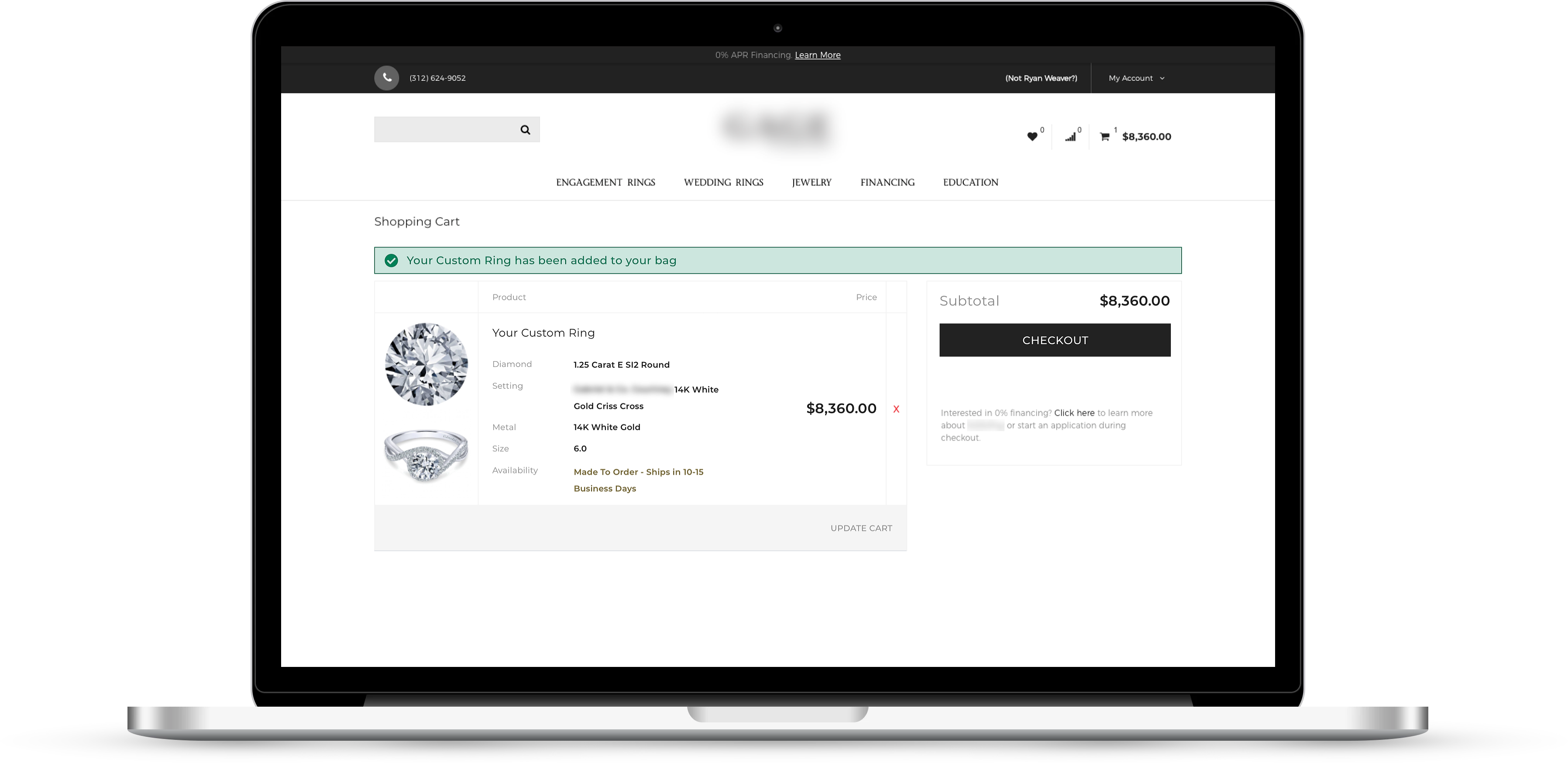
Shopping Cart Page – Proposed
Below, the difference between the current and proposed mobile product page is shown. The current page is cluttered by a ‘header’ that takes up over half of the screen. The proposed mockup puts the visual emphasis on the product imagery and doesn’t allow a menu bar in the center of the screen to compete with it for the shopper’s attention.
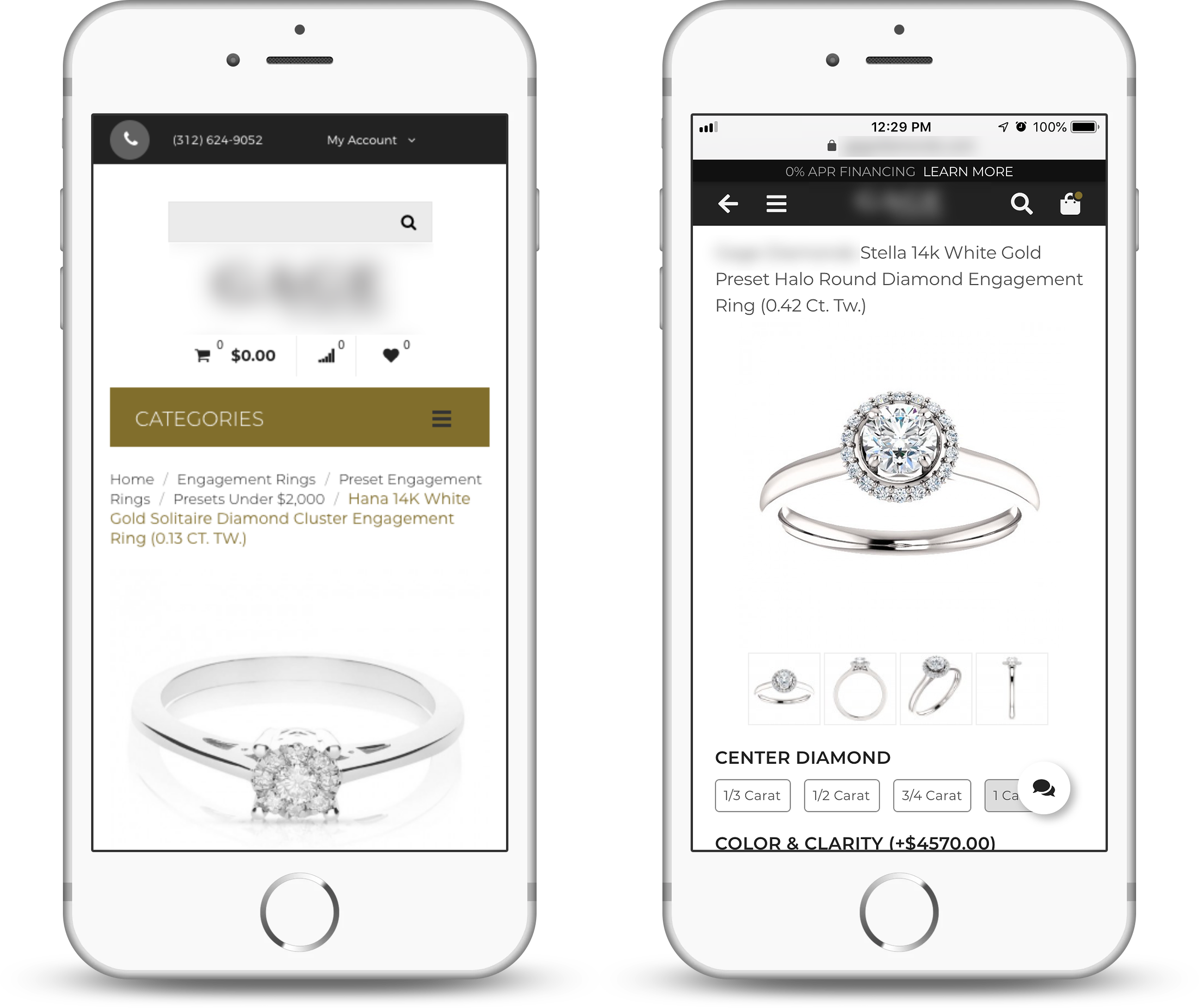
One of the most popular features on the site is the custom ring builder. The existing page on the left below lacks context on the color and clarity selectors. The site has an educational section, but you don’t want potential customers leaving this page in the midst of customizing their perfect ring. To help, the proposed solution on the right adds context to these options. Even if shoppers are familiar with color and clarity grades for diamonds, the additional context here serves to reinforce their knowledge and minimize the cognitive effort it takes to make a selection.
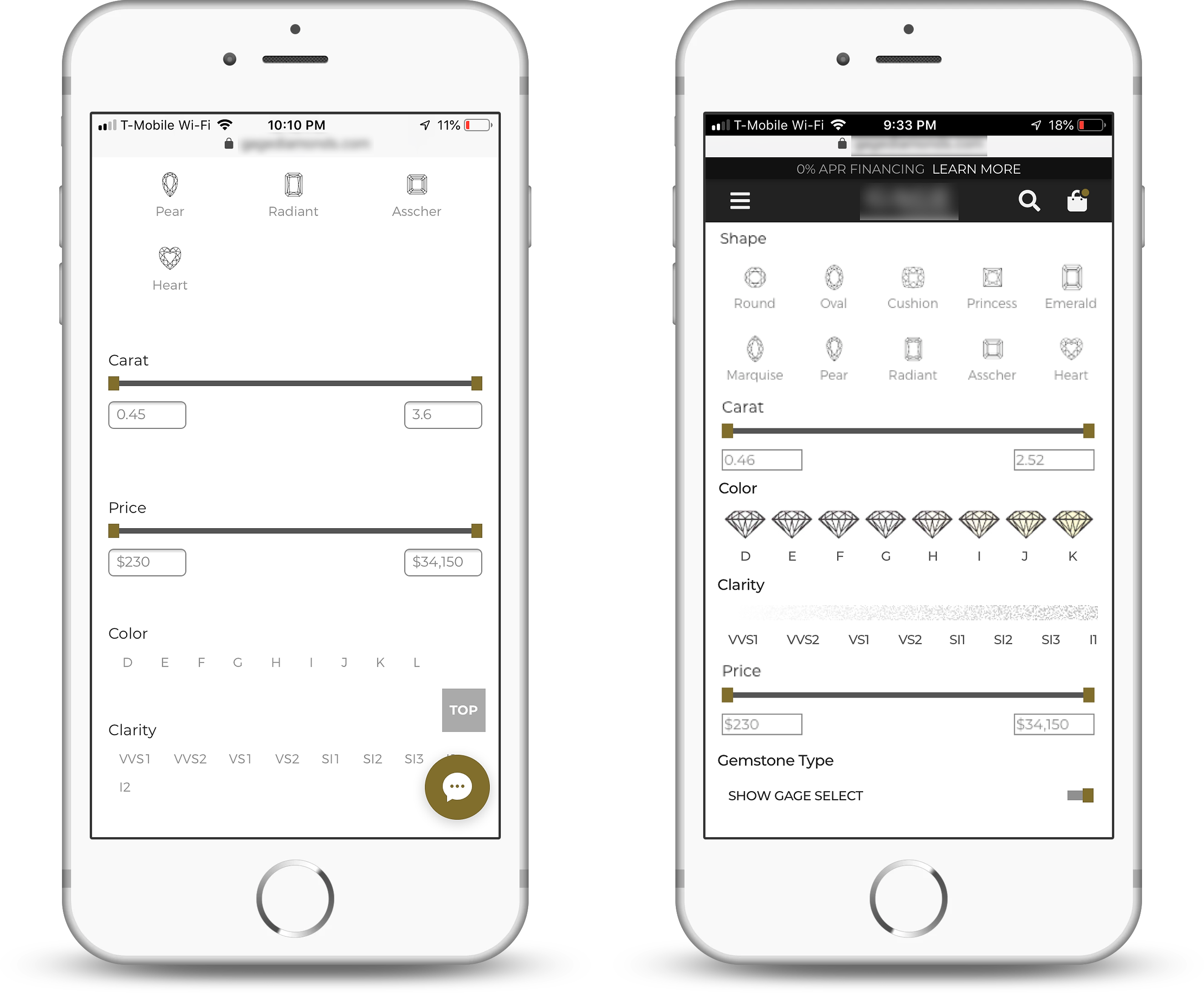
Custom Ring Builder – Current and Proposed
While I do believe it’s extremely important to bring in the additional context, I am also keenly aware that the touch targets for these selectors are extremely small. This proposed solution is meant to be a simple improvement to the existing ring builder application and serve as the leverage needed for usability testing where issues like small target sizes would be uncovered.
Analytics
In addition to reviewing the usability of the site, I was also able to look at the digital analytics to better understand how users were acquired, what they were doing on the site, and if they were converting.
I quickly noticed that about 80% of all activity was happening on mobile devices, with one very notable exception: checkout. This was more evenly split between desktop/laptop and mobile. I also observed that mobile traffic had increased dramatically, going from double desktop traffic a year ago to nearly four times desktop currently.
Immediately I was asking myself why this was the case, who were these users, and why didn’t mobile conversions increase along with the traffic? (I have to admit, I love digging into stuff like this. Unraveling these mysteries is part of what makes my job so awesome!)
What I discovered is that the increase in mobile traffic came almost entirely through Facebook, and when I started to look at the demographics, it seemed to be predominantly women. I hypothesized that the advertising on Facebook was targeting women who had been searching wedding related keywords, and that this group very likely already had engagement rings.