Overview
As the first User Experience designer at RedShelf, I entered an organization with no existing process or consistent design language. This opportunity was one of the primary reasons I took on the challenge of this role and I aimed to develop a consistent, transparent, and scalable design process built on a library of application components that could be used as I grew the design team to ensure consistency and maximize efficiency.
The Problem
The workload was divided between three development teams, each with devoted members of the product team focused only on that team's products. Design was a cross-team endeavor and required external processes that were transparent and could integrate with each development team's distinctive way of working. Internally, design processes had to ensure consistent output, allow for feedback and revisions, but be nimble in order to keep up with demand.
The Process
The process was created with a design-thinking, Agile mindset where new ideas would be tested as we honed the process along the way. Originally, the product team worked nearly exclusively in Asana while the development teams worked in Jira. Balancing mindshare between these two systems was repetitive and inefficient, so I elected to move the design team entirely to Jira.
Unlike the development teams, who worked in two-week sprints, and the product team, who worked in month-long sprints, I felt design had to be more aggressive given the fullness of the workload and number of new products. To that end, we worked in weeklong 'waves,' where we compressed the typical Scrum rituals for pointing, planning, and retrospective, into a single Monday meeting.
The board was laid out with four swim lanes: todo, designing, in review, and accepted. In review was divided into three statuses: design review, accessibility review, and product review. Design review was intended to catch any consistency errors and to provide initial feedback. Education technology demands going above and beyond accessibility compliance, so any time a new process, component, or color was introduced, it would be reviewed by the Director of Accessibility. Finally, the product manager would provide their feedback or move the ticket to accepted.
Any tickets with high-fidelity deliverables would include links to Invision prototypes and Zeplin projects to facilitate handoffs. Invision and Zeplin were both products I introduced to the organization.


Design System
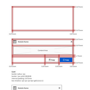
It was quickly apparent that each development team had done their own "design" as each product looked and operated in it's own way. There was no consistent brand or experience. I also knew that I would be hiring and growing the design team, so one of my first goals was to establish a design system that gave each product a similar experience and look. Since many of the products relied on dashboards and step-by-step processes, I determined a card-based design would enable the modularity and customization options needed to support several different personas, while giving users a modern, familiar experience.
Components for the system were created in Sketch, using the Libraries function that allows sharing of reusable components by multiple designers. While I developed most of the components, I also felt it was important for my direct report to contribute to the system, so some of the more complex components--such as a content switch--were assigned to her.
Additionally, once a component was designed, the specifications were handed off to developers to create the component in their library so that our mockups and prototypes would exactly match reusable components that developers on any of the three teams could quickly use.
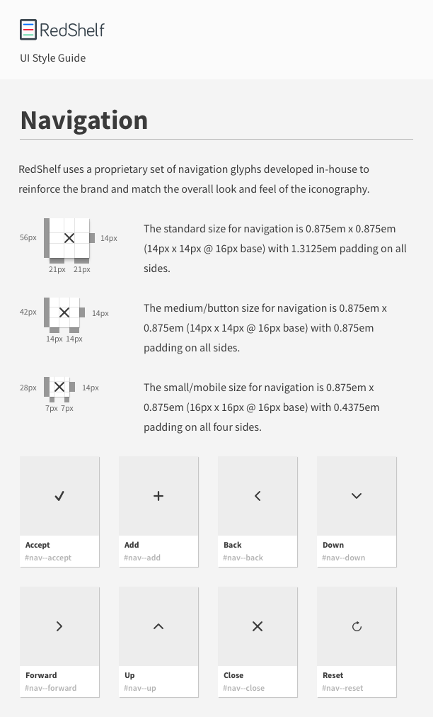
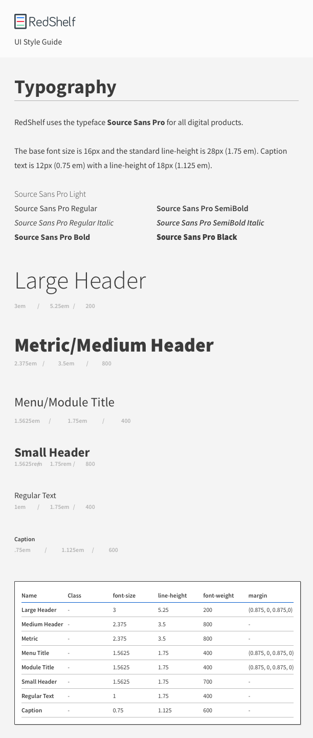
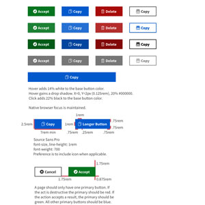
The system includes typography, iconography, colors, navigation, standard controls, and more advanced modules and is being used for the design and development of several new products as well as updates to any existing.
Pro Tip
Using a combination of Sketch symbols and masking techniques, I was able to create the libraries so that icons, buttons, and other components that may be different colors could be updated quickly via overrides.
This prevented the designer's time from being wasted tweaking colors, ensured colors were standard, and, if one needed changed, it would quickly update across every instance in use.
I'm especially proud of the iconography. Noting early on that RedShelf needed so many niche icons that wouldn't be part of a standard set, I decided to develop my own iconography that would be unique and reinforce the brand.


